7x24 Heatmap: When your customers are actually messaging
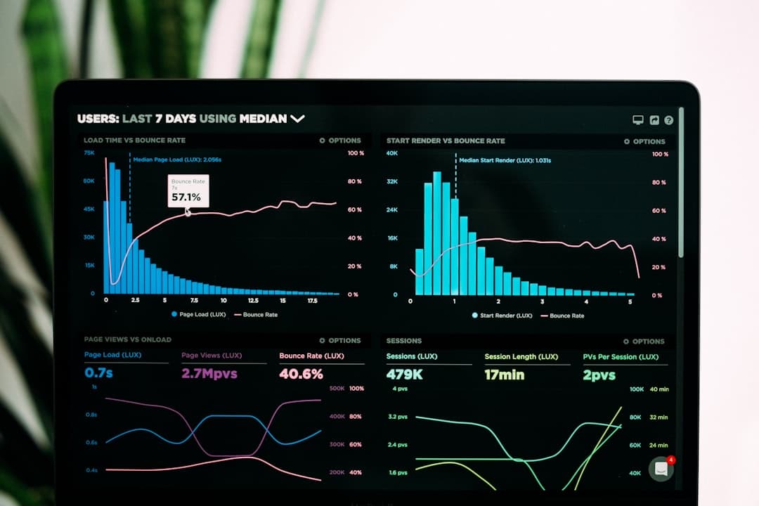
TL;DR: The aiSTAFF dashboard includes a 7x24 heat map that maps all conversations by day and hour and shows actual demand patterns so you can plan promos, staffing, and ad budgets.
What does the 7x24 heat map show
The heat map is a grid: seven rows for days of the week, twenty-four columns for hours of the day. Each cell is shaded with how many conversations occurred in that hour on that day. A dark block at 8pm on Saturday means that Saturday night is your busiest window. A pale bar on weekday mornings means almost no one is texting before 10am. Changes the spreadsheet at a glance.
It sits in a broader view of analytics, along with message count, unique users, response time, bounce and escalation counts, and token usage. Heatmap is the part owners come back to because it answers a question they couldn't answer before: When exactly do my customers want it? If you want this dashboard to work on your own bot, our AI Chatbot Development Service will send it to you. The complete platform is located in the aiSTAFF Hub.
Why time data changes decisions
Most Georgian small and medium business owners have an opinion about busy hours, and this opinion is usually wrong. People assume that afternoon is the peak time because that's when the store personally feels busy. Chat data tells a different story: the bulk of Instagram and WhatsApp messages come after 7pm, when users are at home and scrolling. If you've recruited someone to answer chats between 9am and 6pm, you've covered the quiet half and missed the loud half.
When you can see the actual curve, making decisions becomes easy. You plan to spend your ad before evening, not after. You set the promo to exit one hour before the busiest window. You ensure that your escalation contact is alert and available during the hours that generate leads. None of this is guesswork when the grid is in front of you.
How to read the grid
Several patterns appear again and again, each indicating an action:
- Evening Band. Dark cells from 7pm to 11pm most days means your customers are night shoppers. The always-on agent deserves to be kept here because it's a window people miss.
- Weekend peak. If Saturday and Sunday are bright and weekdays are dim, your audience is shopping on their days off. It's time for your weekly promo for Friday night.
- Dinner Bustle. Around 1:00pm a bright column gives people a break time message. Short, quick answers win this slot.
- The dead zone. The hours that remain pale are the ones where you shouldn't plan a campaign or expect responses to rush in.
The heat map is also read per channel. Your Telegram traffic may peak at different hours than your Messenger traffic, so you can customize each. This comes down to running one brain across five channels while treating them as distinct audiences and pairing them with per-channel KPIs that sit next to the grid.
Working example
Cosmetics store connected aiSTAFF with Instagram and website widget. The owner believed his busy time was midday because that's when he got foot traffic at the counter. Two weeks later, a heat map showed the opposite: Instagram chat volume doubled between 9pm and 11pm, with a sharp spike on Sunday night. He moved his weekly sale post to Sunday at 8 p.m., an hour before peak time, and let the agent respond to the next wave. The same budget pointing to the correct hour has led to more conversations and more lead capture. He did not spend GEL more, he spent the right time.
The agent responded so the late peak was not a staffing issue. The next morning he read the grid, saw where the sound landed and changed it. This loop, see the pattern and then act on it, is what the board is for. Catching late leads instead of losing them is the same logic as choosing where your bot lives.
What the rest of the board adds
The heat map answers the "when". Other panels answer "how well." The response time proves that the agent is fast. The number of backups and escalations shows how often you were unable to respond and had to go to the person, which tells you where your knowledge base has gaps. The cost of tokens usage tracks according to your plan. Unique customers distinguish real availability from a few chatty repeat customers. Read along, you get a weekly health check without reading a single note on the agent. Any bot worth tracking is a metric, a broader read is Automation Efficiency Support, and developers linking this data elsewhere can extract it via the bot API or expose it to streaming widget on the site.
Related reading
- aiSTAFF: One AI Brain Across Channels
- Single message quota on all channels
- One AI Brain, Five Channels
- AI Customer Support Efficiency
- Complete Guide to Chatbot for Business
FAQ
What does 7x24 heat map mean?
This is a 7 day 24 hour grid. Each cell shows how many conversations occurred in that hour that day, so dark cells mark your busiest windows.
Can I see a heatmap per channel?
Yes. The analytics view is divided by channel, so you can compare when your Instagram, WhatsApp, Telegram and website audiences are sending and customize each one.
What else does the dashboard report?
Messages, unique users, response time, backup and escalation counts, and token usage, with daily trends, are all broken down per channel next to the heat map.
How does a heatmap help my marketing?
It shows the exact times customers message, so instead of guessing, you can plan promotions and ad spend ahead of your busiest window.